
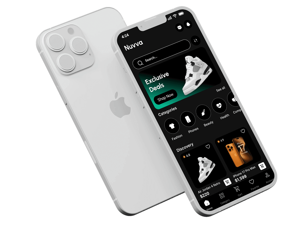
NUVVA
NUVVA
Project Overview
Project Overview
My Role: UX/UI Designer
My Role: UX/UI Designer
Platform: Mobile
Platform: Mobile
Timeline: 4 Months
Timeline: 4 Months
PROBLEM
PROBLEM
Traditional e commerce platforms often prioritize scale and volume more categories, and more
promotional contact under the assumption that abundance leads to better choice. However,
this approach frequently overwhelms users experience decision fatigue, struggle to
discover relevant products efficiently, and form weak emotional connections with the
platform. Instead of feeling guided or confident, users are left to navigate dense interfaces
that prioritize quantity over clarity, ultimately reducing engagement, satisfaction, and trust.
Traditional e commerce platforms often prioritize scale and volume more
categories, and more promotional contact under the assumption that
abundance leads to better choice. However, this approach frequently
overwhelms users experience decision fatigue, struggle to discover
relevant products efficiently, and form weak emotional connections
with the platform. Instead of feeling guided or confident, users are left to
navigate dense interfaces that prioritize quantity over clarity, ultimately
reducing engagement, satisfaction, and trust.
Traditional e commerce platforms often
prioritize scale and volume more categories,
and more promotional contact under the
assumption that abundance leads to better
choice. However, this approach frequently
overwhelms users experience decision
fatigue, struggle to discover relevant
products efficiently, and form weak
emotional connections with the platform.
Instead of feeling guided or confident,
users are left to navigate dense interfaces
that prioritize quantity over clarity,
ultimately reducing engagement, satisfaction,
and trust.
PROBLEM STATEMENT
PROBLEM STATEMENT
Traditional e commerce platform rely heavily on intermediaries, which often results in poor
product quality, misleading listings, and weak customer support. As a result, users struggle
to trust what they see, experience anxiety during purchasing, and feel disappointed when
products fail to meet expectations. Users struggle with overwhelming e commerce
interfaces and want a simpler, smarter, and more human shopping experience one that feels
like a personal assistant guiding decisions, rather than a static product catalog.
Traditional e commerce platform rely heavily on intermediaries, which
often results in poor product quality, misleading listings, and weak
customer support. As a result, users struggle to trust what they see,
experience anxiety during purchasing, and feel disappointed when
products fail to meet expectations. Users struggle with overwhelming
e commerce interfaces and want a simpler, smarter, and more human
shopping experience one that feels like a personal assistant guiding
decisions, rather than a static product catalog.
Traditional e commerce platform rely
heavily on intermediaries, which
often results in poor product quality,
misleading listings, and weak
customer support. As a result,
users struggle to trust what they see,
experience anxiety during
purchasing, and feel disappointed
when products fail to meet
expectations. Users struggle with
overwhelming e commerce
interfaces and want a simpler,
smarter, and more human shopping
experience one that feels like a
personal assistant guiding
decisions, rather than a static
product catalog.
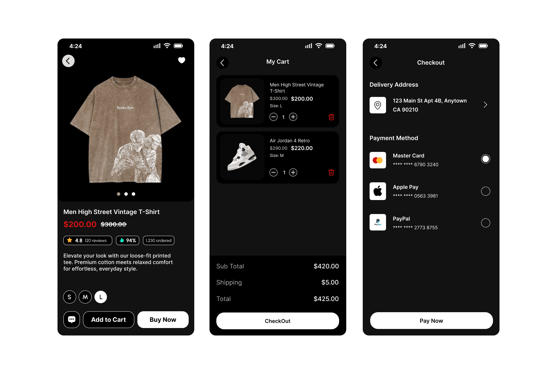
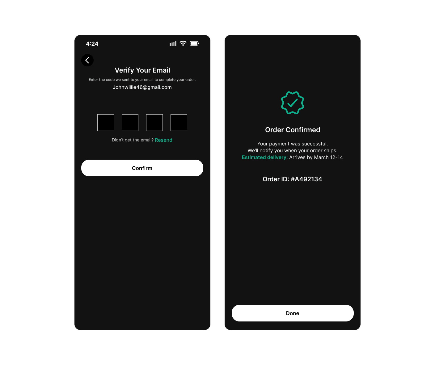
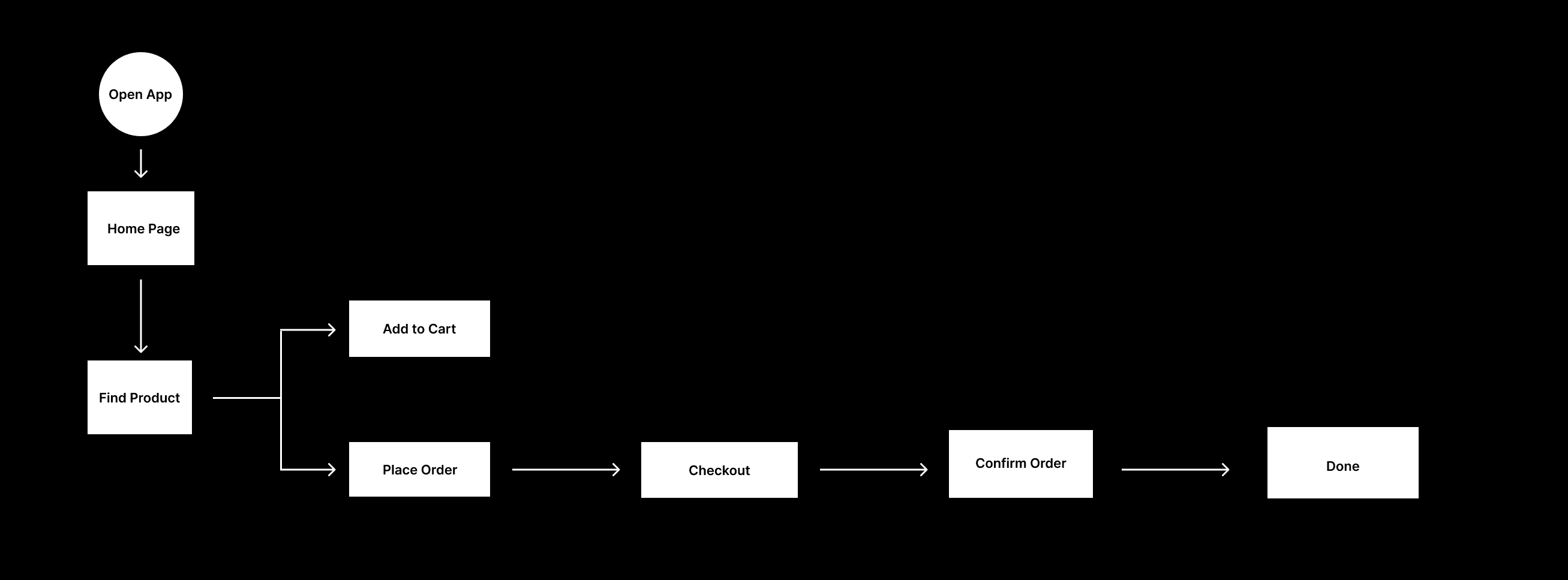
DESIGN DECISION
DESIGN DECISION
Given user pain points around overwhelming e commerce interfaces, low emotional connection,
and trust issues that leads to purchase anxiety and purchase disappointment, the following
design decisions were made:
Reduced cognitive load by applying clear visual hierarchy, generous spacing, and scannable
layouts, helping users process information more easily.
Introduced a personal assistant to guide users through key decisions, providing reassurance
and context during the purchasing journey.
Added intentional friction at checkout to slow down high stakes decisions, reducing anxiety
and encouraging more confident purchase
Improved scannability and clarity by prioritizing essential information and minimizing visual
noise throughout the flow.
Instead of pushing users back into shopping, the checkout completion uses a neutral
"Done" action to give users a sense of closure and control after payment. This reduces post
checkout anxiety and avoids pressing users into immediate re-engagement.
Given user pain points around overwhelming e commerce interfaces, low
emotional connection, and trust issues that leads to purchase anxiety
and purchase disappointment, the following design decisions were made:
Reduced cognitive load by applying clear visual hierarchy, generous
spacing, and scannable layouts, helping users process information
more easily.
Introduced a personal assistant to guide users through key decisions,
providing reassurance and context during the purchasing journey.
Added intentional friction at checkout to slow down high stakes decisions,
reducing anxiety and encouraging more confident purchase
Improved scannability and clarity by prioritizing essential information
and minimizing visual noise throughout the flow.
Instead of pushing users back into shopping, the checkout completion
uses a neutral "Done" action to give users a sense of closure and
control after payment. This reduces post checkout anxiety and avoids
pressing users into immediate re-engagement.
Given user pain points around overwhelming
e commerce interfaces, low emotional
connection, and trust issues that leads to
purchase anxiety and purchase
disappointment, the following design
decisions were made:
Reduced cognitive load by applying clear
visual hierarchy, generous spacing, and
scannable layouts, helping users process
information more easily.
Introduced a personal assistant to guide users
through key decisions, providing reassurance
and context during the purchasing journey.
Added intentional friction at checkout to slow
down high stakes decisions, reducing anxiety
and encouraging more confident purchase
Improved scannability and clarity by
prioritizing essential information and
minimizing visual noise throughout the flow.
Instead of pushing users back into shopping,
the checkout completion uses a neutral
"Done" action to give users a sense of
closure and control after payment.
This reduces post checkout anxiety and
avoids pressing users into immediate
re-engagement.
USER RESEARCH
USER RESEARCH
App Crashes, Bugs, and Technical Glitches
App Crashes, Bugs, and Technical Glitches
Apps often freeze, crash during use (e.g, Amazon's Rufus AI causing crashes, eBay login
errors), or show "something went wrong" messages. Outages affect login, browsing, and
checkout, Walmart had a major one in late 2025.
Apps often freeze, crash during use (e.g, Amazon's Rufus AI causing
crashes, eBay login errors), or show "something went wrong"
messages. Outages affect login, browsing, and checkout, walmart
had a major one in late 2025.
Apps often freeze, crash during use (e.g,
Amazon's Rufus AI causing crashes, eBay
login errors), or show "something went
wrong" messages. Outages affect login,
browsing, and checkout, Walmart had a
major one in late 2025.
Slow loading and Poor Performance
Slow loading and Poor Performance
Pages load slowly, especially with images or searches. Delays in product views or cart updates
lead to frustration and abandoned sessions.
Pages load slowly, especially with images or searches. Delays in product
views or cart updates lead to frustration and abandoned sessions.
Pages load slowly, especially with images or
searches. Delays in product views or cart
updates lead to frustration and abandoned
sessions.
Complicated Checkout and Navigation
Complicated Checkout and Navigation
Lengthy processes, mandatory account creation, hidden fees, or hard to fid buttons cause high
cart abandonment. Small screens makes filters, search bars, or menus awkward.
Lengthy processes, mandatory account creation, hidden fees, or hard to
fid buttons cause high cart abandonment. Small screens makes filters,
search bars, or menus awkward.
Lengthy processes, mandatory account
creation, hidden fees, or hard to fid buttons
cause high cart abandonment. Small screens
makes filters, search bars, or menus awkward.
Search and Filtering Problems
Search and Filtering Problems
Inaccurate results, missing "sold" filters (e.g, on eBay), or poor sorting options make finding
items difficult.
Inaccurate results, missing "sold" filters (e.g, on eBay), or poor sorting
options make finding items difficult.
Inaccurate results, missing "sold" filters (e.g,
on eBay), or poor sorting options make finding
items difficult.
Customer Service and Refund Issues
Customer Service and Refund Issues
Hard to reach support, automated bots with no human help, delayed refunds, or disputes over
return/fakes are rampant especially on Amazon and eBay.
Hard to reach support, automated bots with no human help, delayed
refunds, or disputes over return/fakes are rampant especially on Amazon
and eBay.
Hard to reach support, automated bots with
no human help, delayed refunds, or disputes
over return/fakes are rampant especially on
Amazon and eBay.
Scams, Fake Products, and Fraud
Scams, Fake Products, and Fraud
Counterfelt items, scam sellers, or poor buyer protection erode trust. Apps like Shopify's Shop
get blamed for promoting fraudulent stores.
Counterfelt items, scam sellers, or poor buyer protection erode trust. Apps
like Shopify's Shop get blamed for promoting fraudulent stores.
Counterfelt items, scam sellers, or poor buyer
protection erode trust. Apps like Shopify's
Shop get blamed for promoting fraudulent
stores.
Delivery and Tracking Delays
Delivery and Tracking Delays
Late shipments, inaccurate tracking, or no real time updates frustrate users, even with "fast"
options.
Late shipments, inaccurate tracking, or no real time updates frustrate
users, even with "fast" options.
Late shipments, inaccurate tracking, or no real
time updates frustrate users, even with "fast"
options.
Forced Features or Missing Conveniences
Forced Features or Missing Conveniences
Aggressive pushes for app downloads (e.g, Walmart lacking Apple Pay to promote Walmart
Pay), intrusive ads, or limited payment options annoy users.
Aggressive pushes for app downloads (e.g, Walmart lacking Apple Pay to
promote Walmart Pay), intrusive ads, or limited payment options annoy
users.
Aggressive pushes for app downloads (e.g,
Walmart lacking Apple Pay to promote
Walmart Pay), intrusive ads, or limited
payment options annoy users.
Overloaded with Ads and Recommendations
Overloaded with Ads and Recommendations
Too many sponsored results or irrelevant suggestions clutter the experience, making genuine
shopping harder.
Too many sponsored results or irrelevant suggestions clutter the
experience, making genuine shopping harder.
Too many sponsored results or irrelevant
suggestions clutter the experience, making
genuine shopping harder.
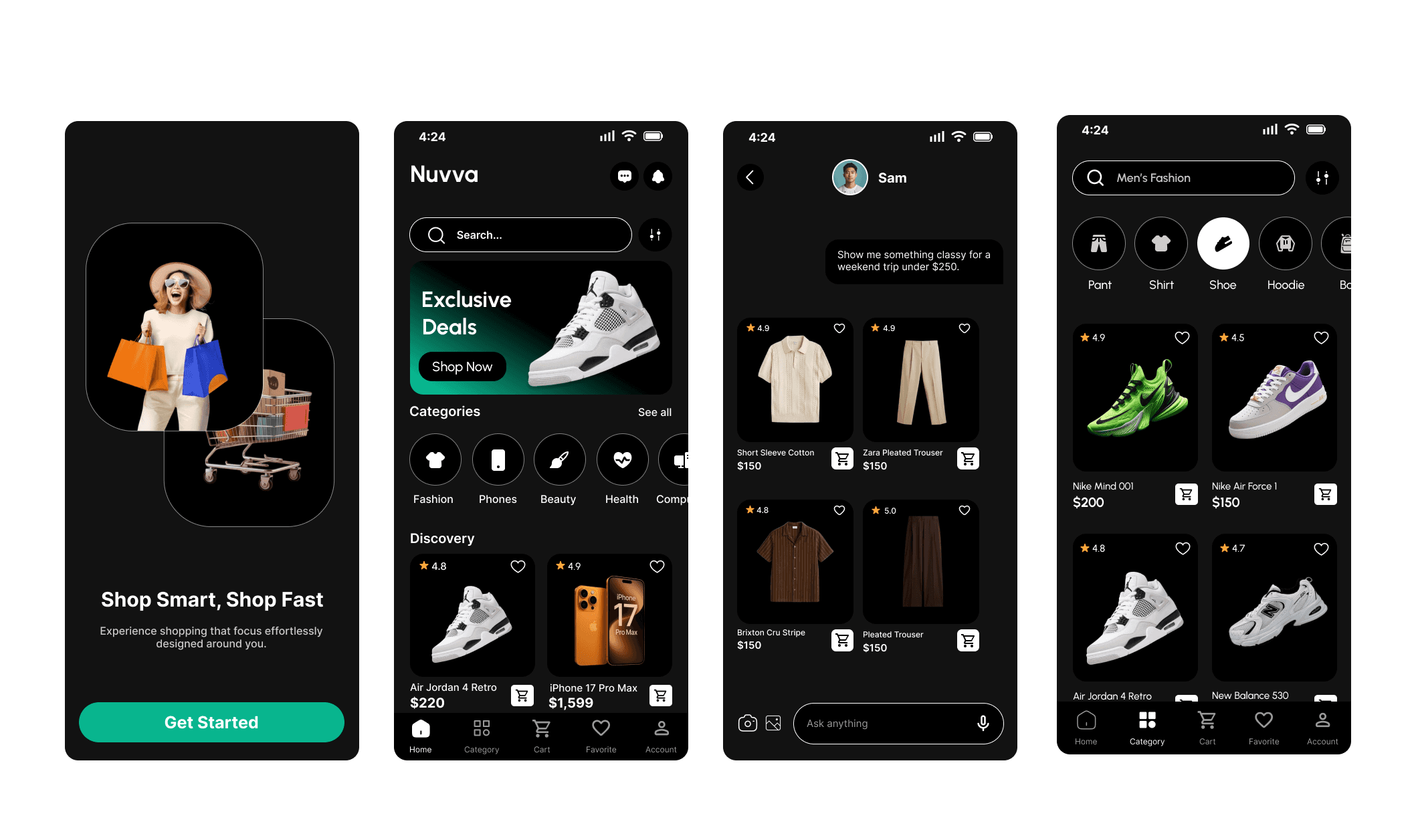
SOLUTION
SOLUTION
Context Award Experience
Context Award Experience
The interface adapts to user intent, mood, and timing to reduce overwhelm.
The interface adapts to user intent, mood, and timing to reduce
overwhelm.
The interface adapts to user intent, mood, and
timing to reduce overwhelm.
Conversational Shopping Guidance
Conversational Shopping Guidance
Users can explore products naturally while knowing human help is always available.
Users can explore products naturally while knowing human help is always
available.
Users can explore products naturally while
knowing human help is always available.
Human Customer Support Escalation
Human Customer Support Escalation
At any point, users can connect with a real support agent for reassurance, clarification, or issue resolution.
At any point, users can connect with a real support agent for reassurance,
clarification, or issue resolution.
At any point, users can connect with a real
support agent for reassurance, clarification,
or issue resolution.
Smart Cart & Checkout Support
Smart Cart & Checkout Support
Proactive suggestions and human assistance help prevent mistakes and post purchase regret.
Proactive suggestions and human assistance help prevent mistakes and
post purchase regret.
Proactive suggestions and human assistance
help prevent mistakes and post purchase
regret.
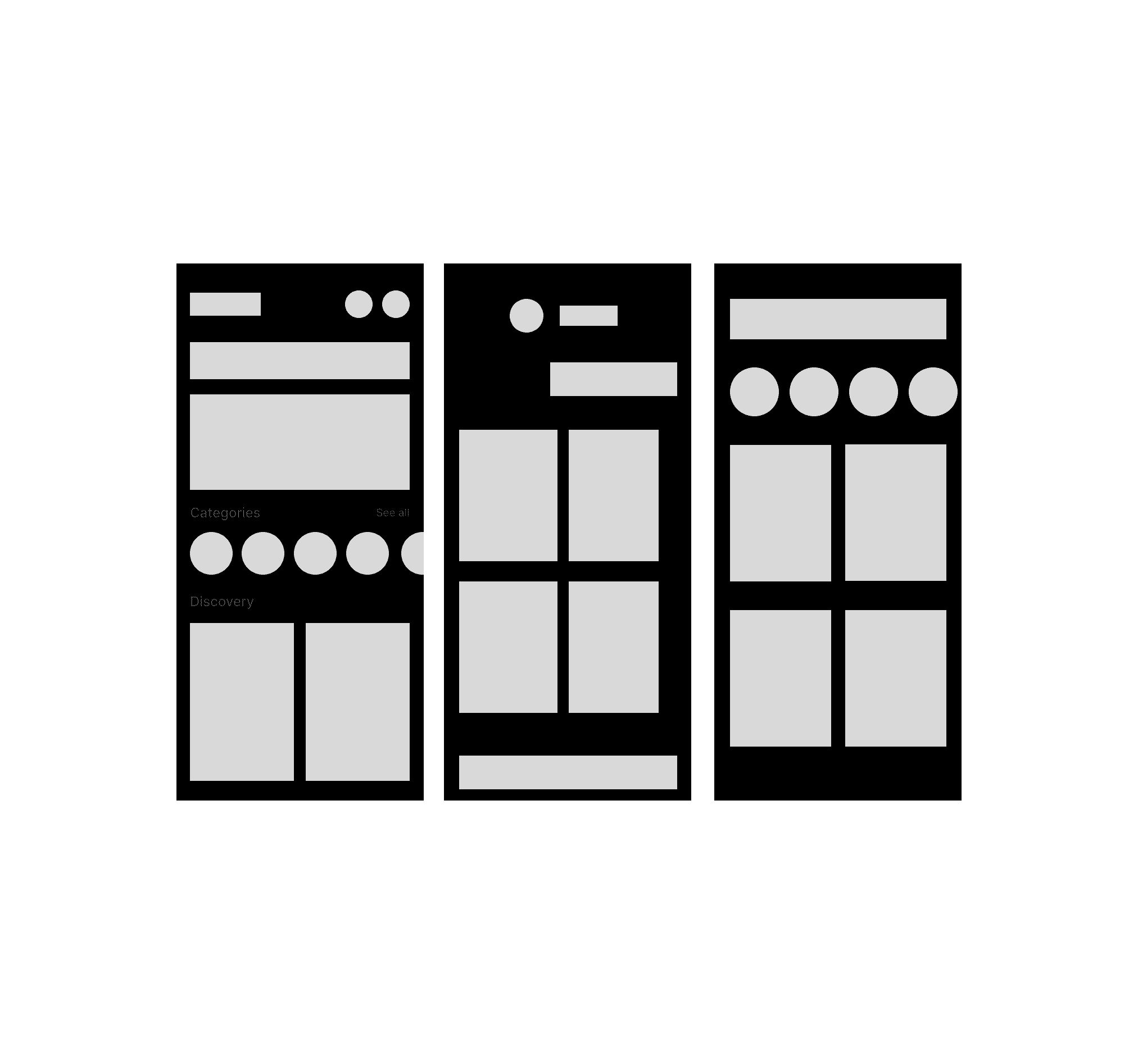
WIREFRAME
WIREFRAME
I explored multiple wireframe layouts to evaluate different ways of organizing content and
guiding user attention. The final direction focused on reducing cognitive load through improved
spacing, alignment, and visual hierarchy, resulting in a more scannable and focused shopping
experience.
I explored multiple wireframe layouts to evaluate different ways of
organizing content and guiding user attention. The final direction
focused on reducing cognitive load through improved spacing, alignment,
and visual hierarchy, resulting in a more scannable and focused
shopping experience.
I explored multiple wireframe layouts to
evaluate different ways of organizing content
and guiding user attention. The final
direction focused on reducing cognitive
load through improved spacing, alignment,
and visual hierarchy, resulting in a more
scannable and focused shopping experience.
REFLECTION
REFLECTION
This project reflects an early stage of my UX growth. While I focused on improving scannability
through spacing and hierarchy, some icons and shapes were oversized, competing with key
content. Reviewing this work helped reinforce the importance of scale, visual weight, and
restraint in guiding user attention principles I apply more intentionally in later designs.
This project reflects an early stage of my UX growth. While I focused on
improving scannability through spacing and hierarchy, some icons and
shapes were oversized, competing with key content. Reviewing this work
helped reinforce the importance of scale, visual weight, and restraint in
guiding user attention principles I apply more intentionally in later designs.
This project reflects an early stage of my UX
growth. While I focused on improving
scannability through spacing and hierarchy,
some icons and shapes were oversized,
competing with key content. Reviewing
this work helped reinforce the importance
of scale, visual weight, and restraint in guiding
user attention principles I apply more
intentionally in later designs.
EXPECTED IMPACT
EXPECTED IMPACT
The design aims to reduce cognitive load, improve scannability, and guide users toward key
actions with greater clarity. These changes are expected to lower purchase anxiety, build trust,
and support more confident shopping and checkout decisions.
The design aims to reduce cognitive load, improve scannability, and guide
users toward key actions with greater clarity. These changes are expected
to lower purchase anxiety, build trust, and support more confident
shopping and checkout decisions.
The design aims to reduce cognitive load,
improve scannability, and guide users toward
key actions with greater clarity. These
changes are expected to lower purchase
anxiety, build trust, and support more
confident shopping and checkout decisions.